
LanGO
Gamified vocabulary app

Overview
People are learning languages for professional reasons. Busy professionals often need to fit their learning around an already packed schedule, and they need to stay motivated. LanGO is an app to help users learning languages on the go, and compete with other learners.
Project Specs:
Project Timeline: January 1 - 31 2024
My Role: UX/UI Designer, UX Researcher
Purpose & Context: LanGO is a project I built as part of my UX Design program at CareerFoundry to demonstrate my skills as a UX Designer
Objective: This project aimed to create a product from scratch to add to my design portfolio.
Technologies & Tools: Figma
The Problem:
“How can we design a language-learning app for busy professionals which provides motivation through competition with other users?”
My Design Process:
I approached the LanGO project using the following design process. My goal was to follow a standard flow for Design Thinking.

Empathize
Competitive Analysis
I examined three popular language-learning apps, McGraw Hill Language Lab, Memrise, and Rosetta Stone.
Strengths
Onboarding is uncomplicated.
Memrise and Rosetta Stone feature intuitive navigation ribbons.
Videos of people saying the target vocabulary is engaging and informative.
Visually consistent design creates an immersive learning experience.
Diverse learning content beyond simple flashcards.
Weaknesses
McGraw Hill Language Lab is text-heavy with few visual elements.
Rosetta Stone is locked in horizontal orientation during lessons.
Rosetta Stone has potential accessibility issues with low-contrast text.
Memrise uses a chatbot which is not explained and could be misunderstood as a support feature.
Insights
Current competitors meet the goals of user experience design with varying degrees of success. Memrise and Rosetta Stone have smooth users flows and polished UI.
The three apps include buttons and heuristic features which could confuse the user.
McGraw Hill Language Lab suffers from navigation issues, but has no user registrations. This allows users to begin using content immediately.
Key Opportunities
Provide users greater control over lesson length.
Focus on accessibility and ease of navigation to allow users to complete lessons without confusion.
Give options for users to complete lesson content with other users, increasing motivation.
Define
User Interviews & Research Goal
To design a language-learning app for busy professionals, I needed input from that demographic of user. The goal of this user research was to ensure that the proposed language-learning app adhered to a user-centred design. After understanding what users looked for, prefered, and needed in a language-learning app, the UX and UI could be created accordingly.
Research Questions
Primarily, the questions asked in the user interviews were designed to answer these questions:
What behaviours and motivations are common among language learners?
How do users react to problems when learning languages?
Under what circumstances do users typically use language-learning apps?
Research Method
This user research focuses on a Qualitative method for uncovering usable information, namely, User Interviews. Through a series of 15 to 20-minute interview sessions with five participants, answers and reactions were collected to assist in the later stages of user-centred design.
Five participants were chosen according to the following criteria:
Adults (ages 35-45 years old)
Frequent users of smartphones and apps
Bilingual or trilingual
Interpreting User Feedback
After recording responses to questions in user interviews, organized the comments into categories for easy reference. To focus on functionality, feelings, and beliefs, reinterpreted the comments into the following framework: “I [verb]…”, “I feel…”, and “I believe…” statements.

POV
User Personas
To design with a real user in mind, goals and motivations for typical users were condensed into a memorable design persona. Goals, frustrations, and tasks were inspired by comments collected during user research.
Alice, a software developer who wants to improve her French to ensure better job security and community integration

Ideate
User Flows
I created a series of user flows to demonstrate how the user will move through the app, and how key functional requirements will connect.
Each task flow was assigned a user-centered objective, based on the persona I created:

Account Creation
Alice: “As a language learner, I want to be able quickly start using the app, so that I can start learning new words.”
Complete a language lesson
Alice: “As a busy person, I only want to use the app for 30 minutes or lesson, so that I can use the time on my morning commute efficiently.”

Wireframes & Layouts
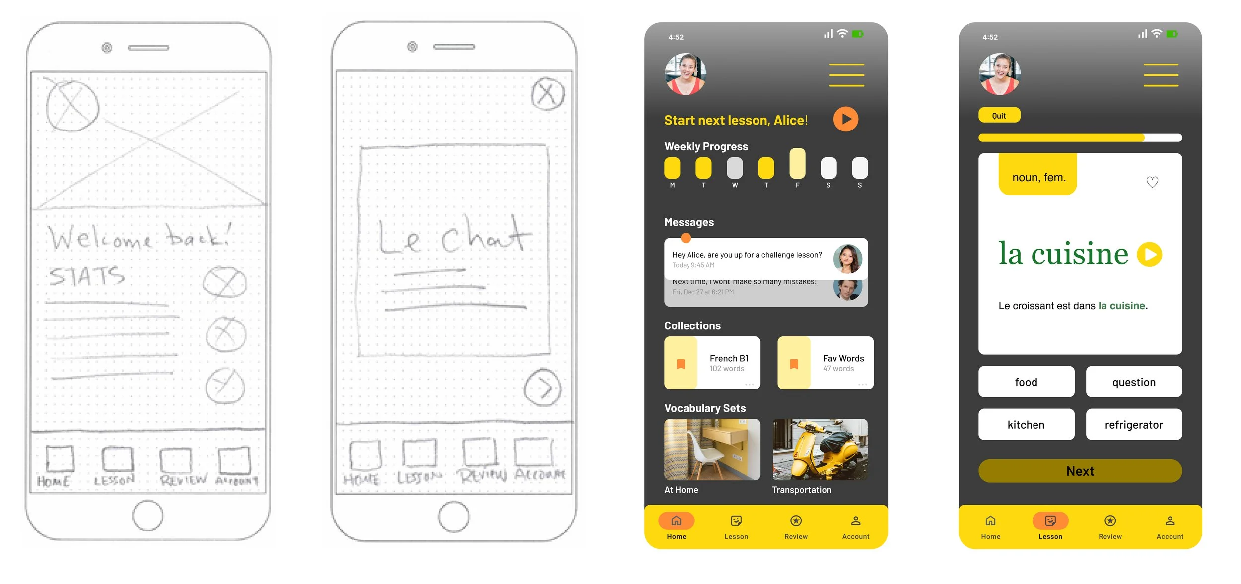
Wireframes & Initial Concepts
When creating the low-fidelity wireframes for the LanGO app, I considered the following:
The primary persona for the design would frequently use the app in-transit or in public places, so the design should be mobile-first to accommodate users on-the-go.
Onboarding user flow

Lesson user flow

Test
Usability Testing
To test the ability of users to proceed through the onboarding sequence and lesson selection sequence, I recruited 5 users to participate in usability testing sessions. These sessions were conducted in-person and through video conference. Participates were asked to complete a variety of Direct Tasks and Scenario Tasks. This usability test used Jakob Nielsen’s error severity rating scale:
Direct Tasks:
Create a user account and complete onboarding
Send a password reset link for an existing account
Complete a language lesson
Discontinue a lesson in progress
Scenario Tasks:
You’ve just downloaded a new app and want to try it out. Create a new account.
You want to access the Dashboard, but it’s been a while since you used the app, and now you can’t remember your credentials.
You’re waiting for the bus and have a few minutes to kill. Try to finish a lesson before the bus arrives.
You started your lesson, but a family member needs help in the kitchen. Quit the lesson.
“I didn’t see a way to save my progress during the lesson.”
“The ‘Account’ screen should have an option for changing my info.”

High Fidelity Prototypes
Building on previous iterations, I further refined the UI for high-fidelity prototypes. At this stage, I aimed for total precision in design, and consistency in how visual elements occurred throughout the whole responsive app.


Style Guide
To systemize the design of the LanGO app, I designed a basic style guide to prescribe the colors and logo style guidelines. The sample style guide below informs UI design decisions for subsequent updates and future designs.

Project Reflections
User feedback is essential. Comments from users validated some design decision, but invalidated others.
Time is a constant constraint. This project was completed in a condensed timeframe. This required a jump from low-fidelity directly to high-fidelity wireframes. A longer timeframe would have allow for more rounds of usability testing and better alignment with the users’ needs.