
NuStride Running App

How I used UX principles to design a running app that gets users active.
Overview
Have you ever wondered if good UX can translate into better health for the user? I have, so I designed a product to explore that idea.
The concept is simple: if good design can improve the user experience, it should also improve the user’s behaviour. Few people are elite athletes, and many struggle to stay active. After listening to users, I designed the NuStride app around that reality.
Project Specs:
Project Timeline: February to August 2024
My Role: UX Researcher, UX Designer
Purpose & Context: NuStride is a personal project I built as part of my UX Design program at CareerFoundry to demonstrate my skills and process as a UX Designer.
Objective: This project aimed to create a product from scratch to add to my design portfolio.
Technologies & Tools: Figma, Lyssna, Optimal Workshop, Word, Excel
The Problem:
“How can we design a running app for regular people that combines run tracking, motivation and education?”
My Design Process:
I approached the NuStride project using the following design process. My process followed a structure, but you can see that it was not completely linear.

Empathize
To empathize with the user, I began by asking myself various questions:
How can I reduce friction in the user experience?
What do popular apps do well, and what opportunities exist for improvement?
What do potential users say about their needs, and features that are important to them?
To answer these questions, I identified friction points in existing apps, conducted competitive analyses, and completed user interviews and surveys.
Competitive Analysis
I examined two popular running apps, Strava and Runkeeper. Both apps have strengths which are good to learn from. Their weaknesses are areas of opportunity for the NuStride app.
Strava:
Strava describes itself as “the largest sports community in the world”. It offers tracking for over 30 activity types.
Bottom line:
A fitness community of over 100 million users worldwide
Tracking for over 30 activity types
A user experience built on engagement with other users
Runkeeper:
The company name, Asics, is derived from the Latin phrase, “Anima Sana In Corpore Sano”, meaning, “a sound mind in a sound body”. The Asics Runkeeper app appears to be a product that has grown from the company’s mission.
Bottom line:
Asics designs a variety of sportswear and is primarily known for running shoes
The Asics Runkeeper app is an outgrowth of the physical product offering and is aligned with the company mission of promoting full-body health

Strengths
Strong sense of a user community which transcends the app.
A reputation as a leader in the field.
Free and paid versions allow users to engage with the app at various levels.
Strong brand awareness is likely to draw new users.
Weaknesses
An array of features and paywalls is frustrating to some users.
Focus is divided across various sports.
Free and paid versions allow users to engage with the app at various levels.
Strong brand awareness is likely to draw new users.
Do not offer comprehensive video training material for beginners.
Insights:
Current competitors are targeting multiple sports.
Current competitors seem to appeal to more elite-level athletes.
Key Opportunities:
Simplify app features and narrow the user’s focus.
Focus on users who are not “elite” or extremely knowledgeable about running.
Define
Problem Statement
Analyzing the competition and interviewing potential users contributed greatly to my understanding of the types of problems real users face when trying to adopt a more active lifestyle. This understanding, and my measure for gauging its accuracy, is represented in the following Problem Statement:
“Our healthcare app users need a way to receive tailored guidance and motivation to pursue an active lifestyle because current products are complicated and designed for highly motivated users.
We will know this to be true when we see users using our app to record their activity for an extended period.”
User Interviews & Surveys
Since my goal was to design an educational running app for regular people, I needed input from people who represent the potential users. Virtually and face-to-face, I gathered input from this demographic.
Qualitative Interviews
Interviews with 5 participants yielded the following high-level insights:
Users only want to see important notifications, but their definition of what constitutes an important notification differs.
Having the support of others is a strong motivation to participate in physical activity.
Many users wear an activity-tracking device.
Most users prefer to learn new things through video.
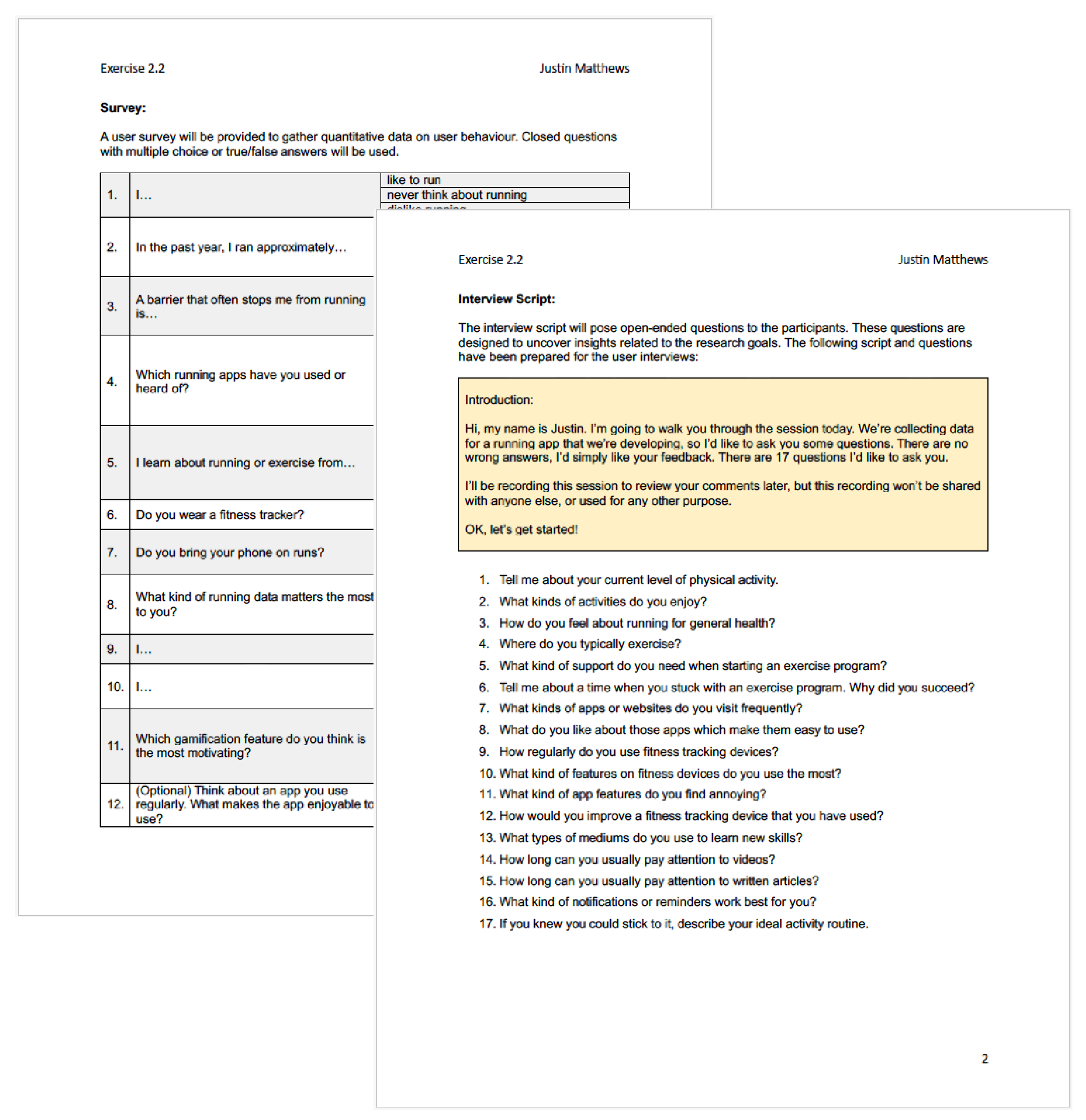
Quantitative Surveys
Following the interviews, I created a 12-question survey to collect quantitative data on user behaviour and distributed it widely. Some highlights from the survey include the following points:
Running Frequency
50%
50% of survey participants ran on and off throughout the year.
Energy is a limiting factor preventing some users from running.
Learning Styles
67.7%
66.7% of users learn about running and exercise through videos.
Device Usage
50%
50% of users always bring their phones on runs, and 16.7% sometimes do so.
Badges and challenges were popular gamification features among participants.
User Research Analysis
Drawing on data collected from user interviews, responses were transcribed and arranged according to the user. Following this, they were grouped into 6 clusters on an Affinity Map: learning methods, guidance & support, notifications, exercise apps, exercise preferences, level & frequency, and barriers & constraints.

Analyzing comments from the users resulted in a series of findings and insights. Some of the most helpful insights include the following:
Users need positive social pressure.
Users value guidance to support exercise (diet) beyond the exercise itself.
Users prefer a UI which is familiar and intuitive.
Users like to combine activities (commuting to work and exercise).
Users feel like they get too many notifications already.
Users believe that energy and weather are the biggest barriers to running.
Business Requirements Document
To approach the design process as realistically as possible, I drafted a Business Requirements Document delineating business objectives, scope, functional requirements, and delivery schedule for the NuStride app. This document served as a touchpoint as the project progressed to conceptualization and iteration. Some of the functional requirements for the MVP include:
An onboarding process, including a log-in and sign-up flow
A user dashboard, from which the user can navigate through the app
A menu system for accessing running guides and the user’s profile
A method for tracking activity and recording results from the run
Educational content, including the running guides

POV
Designing with the user in mind
Building on the data gathered from the competitive analysis, and user interviews, I created a series of User Stories to express the functional requirements decided in the Business Requirements document:
“As a novice runner, I want to see from the dashboard where my running stats are, so I can measure my progress.”
“As a regular user, I want to be able to sync the app with my fitness tracker, so I can view my progress within the app.”
User Personas
The findings and insights from the user research were condensed into 3 memorable design personas. These personas represent the collective feedback of groups of users:

Brandon, a tech-savvy pro who wants to be more active since he started working from home
Audrey, a creative professional who wants to incorporate exercise into her daily routine
Debra, a professional who doesn’t like running but who enjoys walking. [edge case]
Ideate
Mental Models
I tried to include the user’s emotional experience in my design process. To visualize the processes the user will go through interacting with the NuStride app, and to stay focused on empathy, I created User Journey Maps to explore account creation and navigating to training material. It was helpful to remember that the initial sign-up process, and finding training articles might be tricky. This understanding informed later design decisions.

User Flows
At this stage, I considered a distinct UX challenge: How can I balance the users’ needs with the business requirements I decided on earlier? I created a series of user flows to demonstrate how the user will move through the app, and how key functional requirements will connect.
I assigned each task flow a user-centered objective, based on the personas I created:
Brandon: “As someone with no running experience, I want to have guidance and support to set achievable running goals, so that I can spend more time outdoors.”
Audrey: “As a busy entrepreneur who has just started running, I want to be able to find and save nutritious recipes, so that I can refer back to them in the future.”

Information Architecture & Card Sorts
As I designed the IA for the NuStride app, I had two goals:
Save the user from difficult decisions
Create a logical structure
I used a sitemap to organize the app’s hierarchy. Deciding the IA was an iterative process. My initial sitemap was tested against card sorts with potential users. This information was analyzed using a similarity matrix. Later, it was adjusted further as I took the prototype through usability testing.


Prototype
Wireframes & Initial Concepts
When creating the low-fidelity wireframes for the NuStride app, I considered the following:
Decide navigation heuristics for functional and intuitive design.
Select familiar menu options, connected to established user needs.

Mid-Fidelity Wireframes
With basic functionality decided upon, design iterations progressed to mid-fidelity prototypes. This stage allowed me to introduce more functionality corresponding to the user's needs. Specific design aspects at this stage include:
Application of a 4-column grid system for mobile.
More attention to the placement of screen elements.
Prototyping flows in Figma to test earlier user flows and informational architecture from the conceptualization stage.

High-Fidelity Prototypes
At the high-fidelity stage of design, I began usability testing with groups of users who matched the needs and motivations of the primary personas. Usability testing, and later collaborative design, led to continuous iterations of the prototype. Notably, at this stage I took other actions to strengthen the design, including:
Design and application of a design system for consistency and improved trust.
Accessibility design considerations.
Incorporation of some design elements from Material Design.


After creating an account, users navigate to the dashboard. The FAB on the dashboard allows users to perform quick actions, like logging runs or meals.
The main sections of the app are accessed using the navigation ribbon at the bottom.
With the submenu at the top of each section, users can explore more content and functionality.
Design System
To systemize the design, I created a Design System, incorporating elements from Material Design.

Accessibility
To ensure the availability of the NuStride app, I took some time to consider accessibility. I examined the high-fidelity prototype focusing on colour contrast, in-app guidance, and text size. Using the Figma plugin Stark, I adjusted the prototype according to the Web Content Accessibility Guidelines (WCAG) to achieve AA or AAA rankings for each screen.

Test
Usability Testing
Equipped with a high-fidelity prototype, I returned to the users for usability testing. This usability study aimed to assess the learnability of the mobile app and identify errors that the users make. To do this, the users interacted with three core features of the app: account creation, logging exercise data, and searching for educational content.
Test Objectives
Understand how the users interact and interpret the app's navigation structure.
Observe how the functionality of the app conforms to the user’s expectations.
Testing sessions were carried out both in-person and remotely.

Evaluation
Observations, comments, and criticisms were collected during usability testing. To evaluate and analyze this information, I documented the feedback on a rainbow spreadsheet and an affinity map.
Learnings
Issue 1: The FAB is too large and blocks content on the Dashboard.
Suggested Change: Redesign and reposition the FAB near the Navigation bar.
Issue 2: Users could not find recipes in the Learn Section.
Suggested Change: Relabel ‘Learn’ to ‘Nutrition’ and divide educational content between the ‘Nutrition’ and ‘Run’ sections.
Issue 3: Users expected their run stats to appear at the top of the Dashboard.
Suggested Change: Move the user’s run stats to the top of the screen.
Issue 4: Users hesitated after resetting their password, uncertain how to proceed.
Suggested Change: Created an acknowledgement screen informing the users to check their email for a password reset link.
Issue 5: Users misinterpreted the icons on the screen.
Suggested Change: Created coach marks on the Dashboard after account creation. Also, a ‘Help’ option could be inserted on the top of the Dashboard to recall the coach marks.


Iteration
Building on the Learnings gathered through Usability Testing, I began iterating the design.
User Feedback:
Several users reported that the FAB was too large and blocked content on the Dashboard. Various sizes, shapes, and placements were experimented with.
Solution:
The final design incorporated the Material Design FAB.
User Feedback:
Users struggled to associate the Learn section with the location of Recipes.
Placing running content alongside recipes was not generally understood and led to frustration.
The submenu within the Learn section was not readily understood.
Users had some confusion while navigating the Dashboard.
Solution:
The Learn Section was renamed Nutrition, and Recipes were moved to this section, and the icon was changed.
Educational articles about running or nutrition were divided into their respective categories in the navigation bar.
Coach marks were added to the Dashboard.


Design Collaboration
I invited other UX designers to view the high-fidelity prototype to gain a fresh perspective on elements that need more attention. This collaboration led to some specific feedback implemented in the high-fidelity prototype.

Project Reflections
The design process is not linear. Constant ideation forced me to regularly return to empathizing with the users. This would lead to new prototypes. These prototypes would reveal new insights through testing. Then the process would start again.
The UX designer and the user are partners in the design process. The users told me what they wanted, but it was up to me to apply UX design methodologies in response to the feedback.
User needs and business needs have to balance when designing a new product. As a UX designer, I’m attentive to listening to the user, but I can’t do this at the expense of the sacrificing business needs.